UofT Event Hub
Designing a mobile event platform that enhances student connectedness at the University of Toronto (UofT).
Tools Used
Figma
Power Point
Mural
Team
Gabrielle David
Gloria Luk
Malliha Fatima
Dania Mohsin
Category
UX design course project
Timeline
Sep - Dec 2021
(12 weeks)
Problem Space
For this fundamentals of user experience course project, our team was prompted to design a solution to solve problems associated with student life at the University of Toronto in collaboration with UofT’s Innovation Hub.
Inspired by the team’s understanding of the importance of having social connections during our own university experience, we decided to focus on designing a project that enhances the domain of student connectedness.
Objective
With this problem space in mind, our team wanted to bridge the gap between UofT students and finding social events in aims of creating opportunities for making social connections.

Process
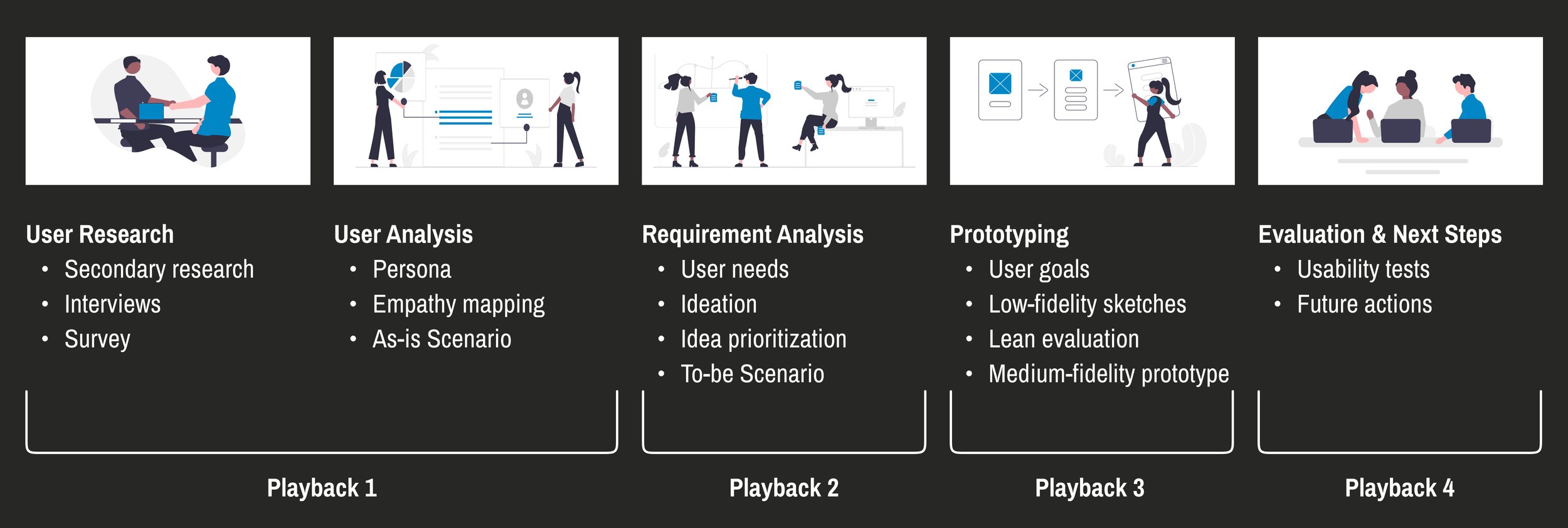
From problem to design concept.
The project followed an iterative design process based on IBM’s activation journey framework. In particular, we conducted user research, analyzed and created representative users, discussed user requirements, prototyped a minimum viable product and evaluated our prototypes. After each major step in the design process, a supplementary playback was also completed to measure our progress, tell our design story, and receive feedback from industry professionals.
User Exploration
Understanding the problem and the user.
To contextualize the problem and identify common pain points within the problem space of student connectedness at UofT, our team focused on exploring the current experience UofT students have with establishing social connections by identifying the motivations and challenges of making these connections, and by examining how they feel about the current resources the university provides for fostering connections.
Interviews
To gather qualitative insights into the current student experience with making connections in the university environment, our team conducted 10 semi-structured interviews with UofT students from a variety of programs.
Surveys
To further understand the thoughts and opinions on the current state of making social connections at UofT, we also published a Google Form and posted it into various social media student groups and platforms. We received 35 responses, all from UofT students.
Findings
Being connected with school peers was essential to students because studying and strictly focusing on academics can oftentimes be difficult and regularly involves a great deal of stress.
A majority of students were not aware of the current platforms and opportunities offered by UofT to aid in creating social connections and a sense of community among students.
Of the students who were aware of the university’s offering, they noted that it is an oversaturated system which makes things relevant to the students difficult to find.
The team then contextualized the research by creating a persona that represented the student users at UofT, and we also mapped the current journey for how students make social connections through events in the university environment.
Ideation
With a deeper understanding of the current context of student connectedness at UofT and the related issues, the team began brainstorming big ideas.
We first established user needs, and from there, ideated the key features and the interaction workflow a user would take while using these features.

Low-fidelity Prototype
To draft these ideas, we began by sketching out paper prototypes of key task flows that were based on our ideas, established design goals, and our ideal envisioned journey for making social connections through events at UofT.
The three tasks that we decided to focus on were:
1. Onboarding and setting user preferences
2. Filtering to find specific events
3. Exploring and registering for popular events
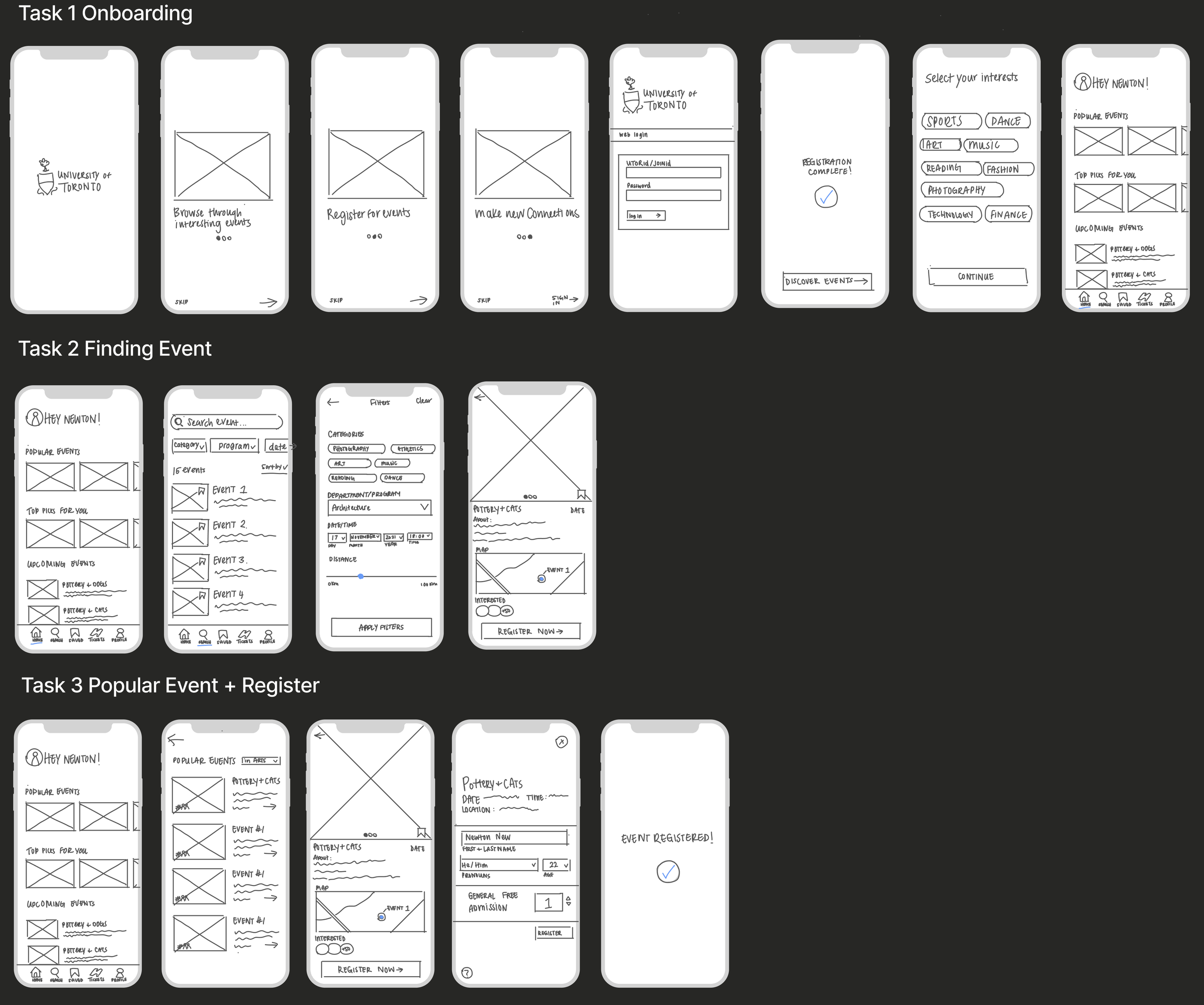
With our initial design, we then conducted lean evaluation with three representative users in aims of gauging participants’ expectations and their overall comments when it comes to the design of our task workflows.
These lean evaluation results then informed our design for our medium-fidelity prototype iteration. The primary changes we made based on the evaluation are shown below:
Design Decisions

Setting User Preferences
All participants expressed concerns of not being able to skip setting up their interests during the onboarding process.
Thus to give users the freedom of choice, a “skip and do later” option was added.

Finding the Filter Option in Search
The filtering process went against the participants’ expectations. They expected the filter options to be grouped and contained in a “filter” menu. Instead we incorporated imbedded filter options on the search page which was confusing for users.
We added a “Filters” button to clarify this action.

Enhancing Filtering Options
Participants noted that they would rather have a map view that lets you see events in a certain area rather than a distance tool. Additionally, they expressed that filtering events based on a period of time and date may be more effective than by specific times and dates.
We addressed this by adding a the “Date & Time” window, and the “Map Area” view.
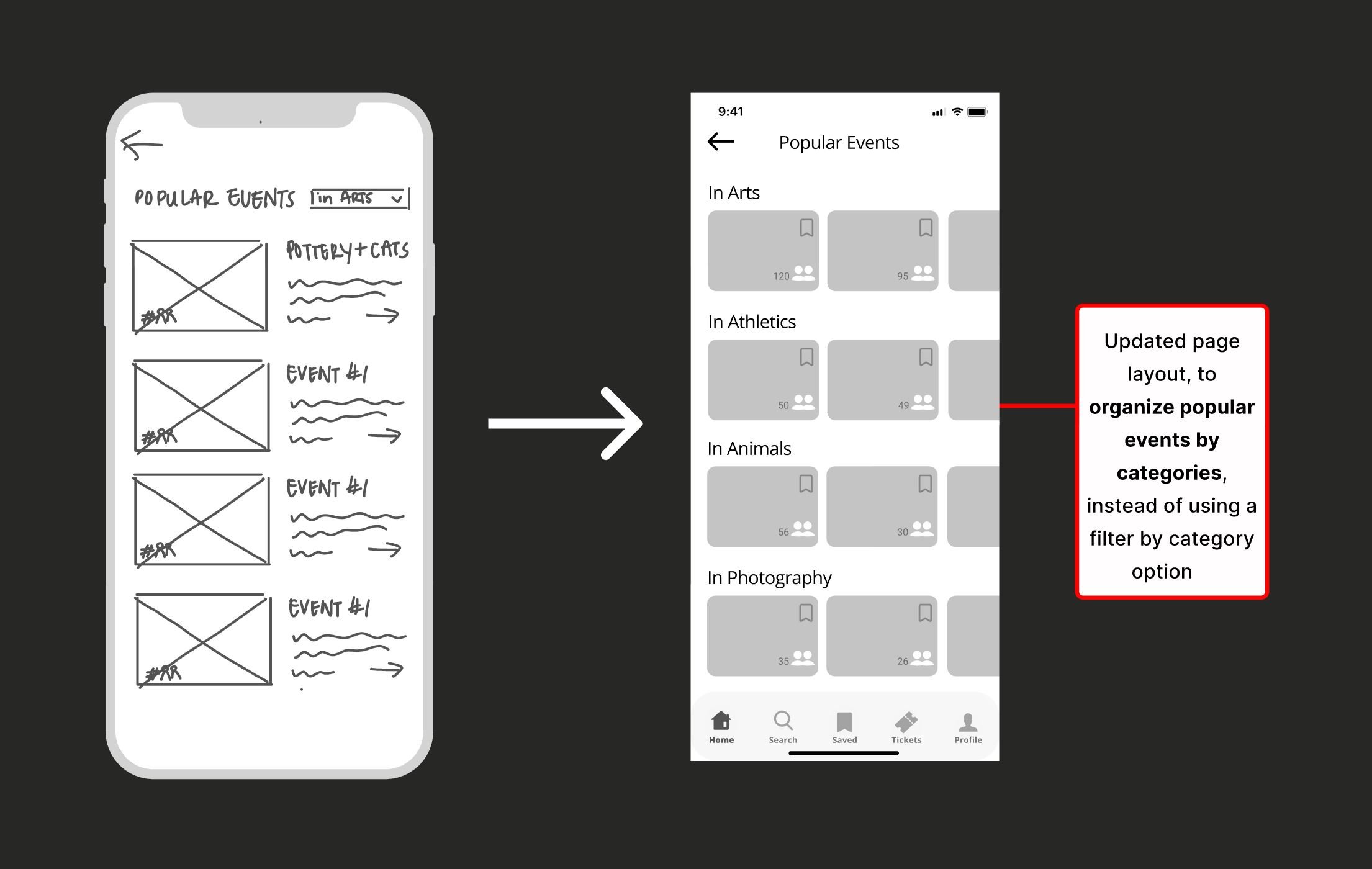
Popular Events Page Layout Change
Respondents explained that changing category filters at the top of the page was cumbersome and restrictive.
Hence, the layout of the popular page was split into categories with side-scrolling to browse through the events instead of having to change the category filter at the top of the page.
Medium-fidelity Prototype
With these changes, we developed a clickable medium-fidelity prototype and conducted usability tests to further reveal insights on the usability of the current workflow for each task. Below is a walkthrough of the prototype and the workflows for user tasks.

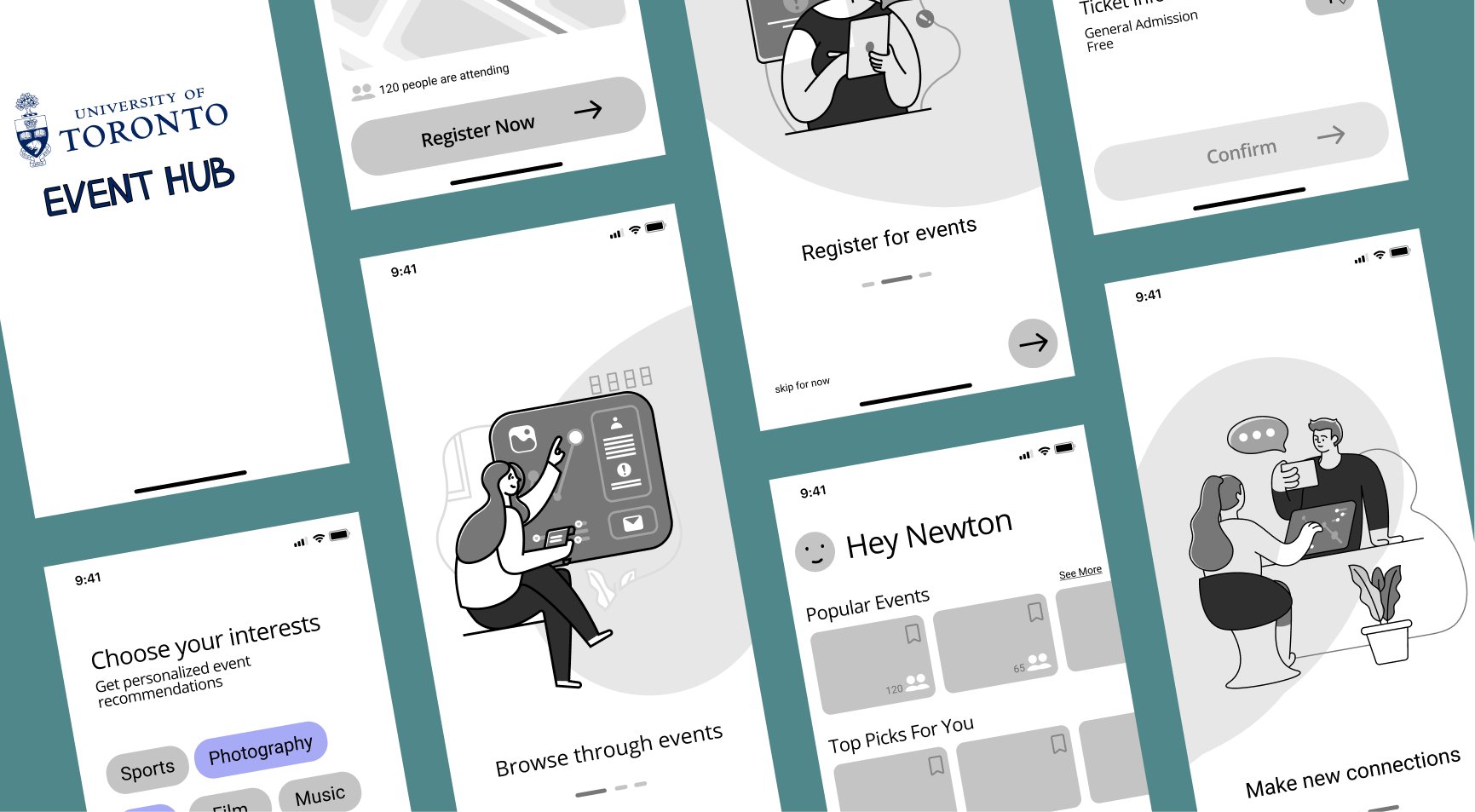
Onboarding Pages
First time loading the app, users are automatically taken to the instructions screens in which they are briefed on the app’s purpose.
User Preference Pages
After signing into the app for the first time, users are taken to a preferences quiz in which they select their interests to get personalized event recommendations when using the app.


Search & Filter Pages
When searching for events, users can utilize filter options to find events based on a selected criteria.
Event & Register Pages
From an event information page, users can easily register by inputting their contact information.

Key Takeaways
Personal lessons.
I am not the user.
From conducting usability testing, I learned to shelve my own opinions and expectations so that I can find out how my ideas work out for others. With this, I realized that as a designer, I have certain biases that can influence my design and these biases may not line up with the expectations of real representative users which in turn, can lead to ideas that do not match representative users’ mental models.
Organization in Figma.
Throughout the prototyping process, I began structuring my work (files, pages, projects, assets) in a way that is standardized or understandable by a team. I also developed proficiency with utilizing master components to streamline the process of making changes to the project.
If I had more time.
High-fidelity Prototype.
I would want to further iterate on the project solution by developing a high-fidelity prototype based on the usability testing results of the medium-fidelity prototype.
Consider Another Key Persona, Event Organizers.
As event organizers are the other key user that will interact with Event Hub, future iterations would focus on discovering and designing for their needs regarding event listing platforms.